
Color Psychology in Marketing and Branding
Color Psychology Marketing
Color Psychology in digital marketing is essential when building your brand about color. You need to pick a color representing your brand & understand the color psychology to trigger subconsciously to your target audience.The shade is a great way to catch attention and communicate meaning.
Making a fantastic first impression is crucial. Studies suggest that our mind procedures images 60,000 times faster than text, and 90% of data delivered to our brains have been visual.
An effective marketing campaign will create a connection between your brand and the consumer. This can build brand awareness and loyalty. As a brand, this information is valuable, and you want to ensure you have a strategy behind the colors you want to use to connect with your target audience and inspire them to connect with your brand.
Understanding the psychology behind colors and using the right ones for your brand will help you build your audience and drive conversions.
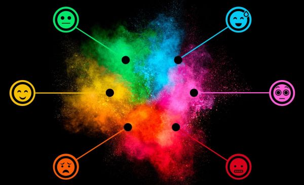
Colors and Their Psychology in Business
Red
Red is the color of attraction. When you see red, it will generate emotions of excitement, passion, danger. It is common to see many websites to design the order now button or sales advertisement in red, in the hope of attracting more people. Brands like YouTube and Coca-Cola use red as their brand color. It is wise to use this color sparingly and in the right place.
Blue
In the field of Color Psychology Marketing, blue signifies peace, and calm. Your instinct would refer to the ocean while seeing blue. So, blue keep a peaceful, stable, calm environment. You will see that some brands use blue in their logo and navigation bars. Whereas brands like Facebook, Twitter, and Skype, use blue as their official color.

Green
The color green indicates nature. So, it has a great generous impact on your cognitive powers. Also, green indicates money grows and prospers. Like all other colors, green can also be used for different purposes. The soft look of this color makes the brand endorsement more sophisticated. Statistics show that brands dealing with health and fitness also have a fascination with green.
Orange
In color psychology, orange promotes enthusiasm, excitement, creativity, optimism, and other positive feelings. Often this color can be helpful to drive a rush of adrenaline. Besides, this color can go in contrasting nature with most of the other colors. It’s attractive and the center of eyeballs. Nickelodeon is a kid’s channel that uses orange in the logo.
Purple
Purple has a royal look. It indicates the nature of great wisdom in clients. It also signifies spirituality, nobility, and power. But this color can have some persuasive Nature too, so you should avoid using it too much. Using it too much may leave an impression of arrogance. Yahoo is one of the famous brands that use purple as their brand color.

Black
When we see black, the first psychological impressions that come to our mind are about power, elegance, and mystery. Scientifically black is not a color; rather, it is the absence of color. Sometimes, black is also used to signify intelligence.
Many brands chose black as a representative color. Although this color is a bit tricky to use, many fashion endorsements have used it fruitfully.
Grey
In color Psychology Marketing, Grey is the representative of neutral cognition and balance. Also, it is a color of old age and solidarity. This color has a matte look, so overusing it can cause a loss of inspiration. Apple is one of the Companies that use grey as a brand color.
White
As the genuine nature of white, in color psychology too, it represents godliness, peace, spirituality, innocence, and humility. Although the meaning of white is not constant across the globe, it still drives a morality in the audience.
Brown
Brown is the color of earth, wood, stone, and mud. Psychologically brown signifies down to earth, humble nature. Along with this, it also indicates comfort and security.

Yellow
Yellow is a bright color. It is the color of sunshine. So, it gives the subconscious mind a pleasant, confident feeling. Sunlight is the source of energy, positivity, and a symbol of a new beginning. So, it is also recognized in such positivity.
Pink
Pink has a gender-specific advantage. Research has proven the influence of pink on the feminine audience. So, it is not very efficient for the gender-neutral target audience. However, it has a very gentle influence on the subconscious mind. It represents love, femininity, and playfulness.